Enhancements to Recruitment Applications
Our recruitment module is pretty much our most popular part of HR Partner that our customers use and love. However, we have had feedback that the user experience could be better. Especially when viewing the Application details screen for each candidate.
Quick switch Sidebar
At the moment, the process of clicking on the Job Listing view screen, opening an application, reading it, then having to go back to the job listing view screen again to open the next application is tedious, slow and time consuming, especially when you have hundreds of job applicants.
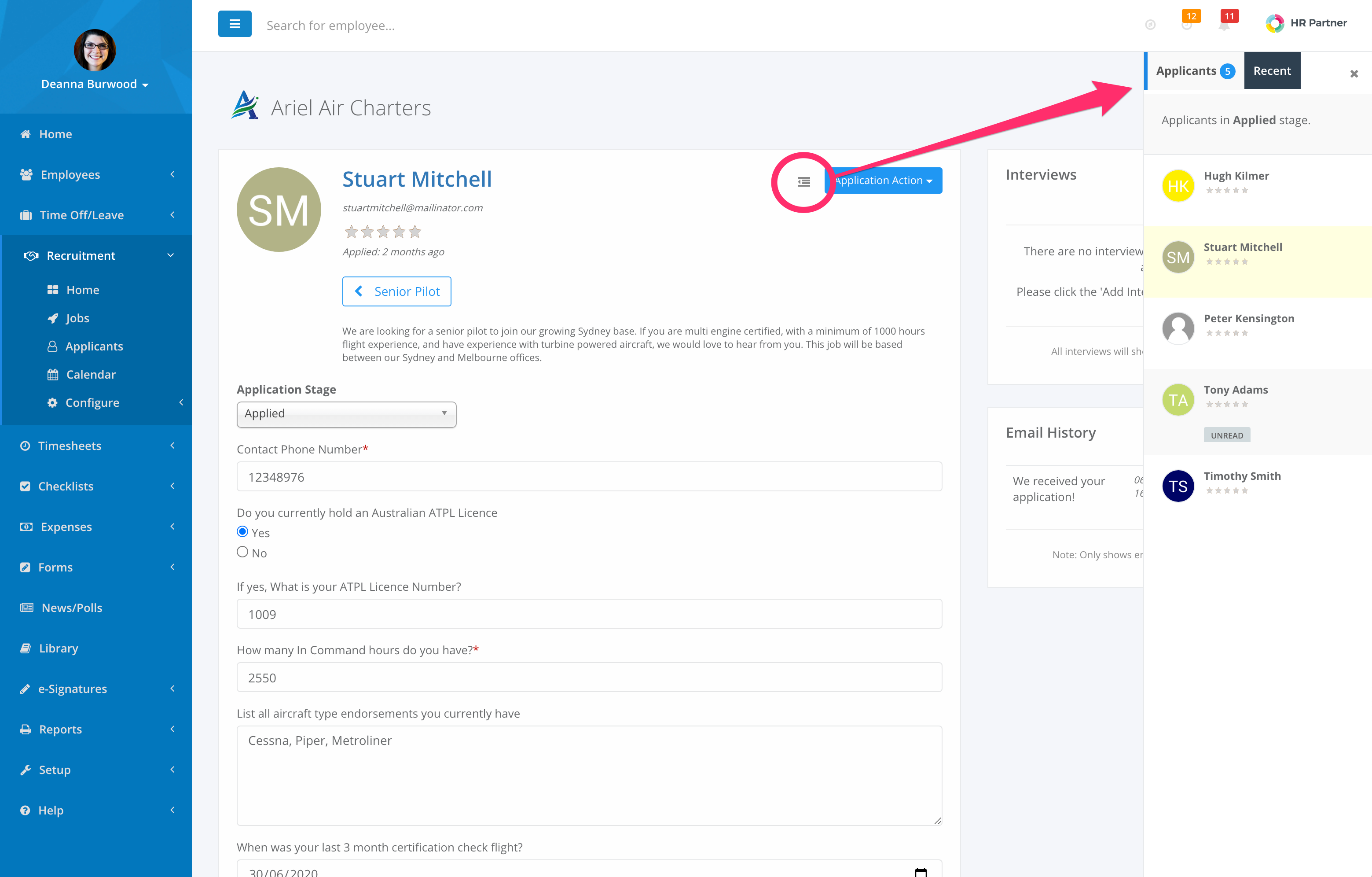
So our designers have been busy and we think we have come up with a neat way of quickly jumping between candidates while keeping the Application view screen open! Just click on the new icon to the left of the 'Application Action' button to open a sidebar showing you ALL applicants in the current stage of the job pipeline.

The current applicant is highlighted in yellow, but you can click on any other applicant to open their application screen while keeping the sidebar open.
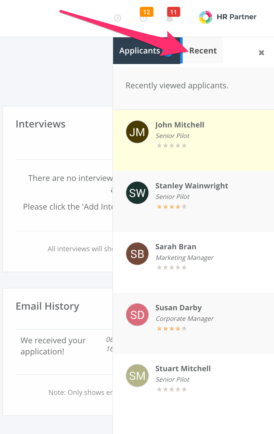
We also 'remember' the last 10 or so candidates that you have looked at within the 'Recents' tab on the sidebar, so now you can quickly jump between your final few favorite candidates when narrowing down the selection in the final stages!

(Note: This holds your favorite candidates across multiple job listings so you can quickly jump between them).
Auto saving Stage changes
Another thing that was annoying our users was the fact then when they were viewing the application screen, and they made a change to the current stage the applicant was in, it didn't save the change until they scrolled down and clicked the 'Save' button. Often, users were so caught up in reading the form answers or booking interviews that they would forget to save the change.
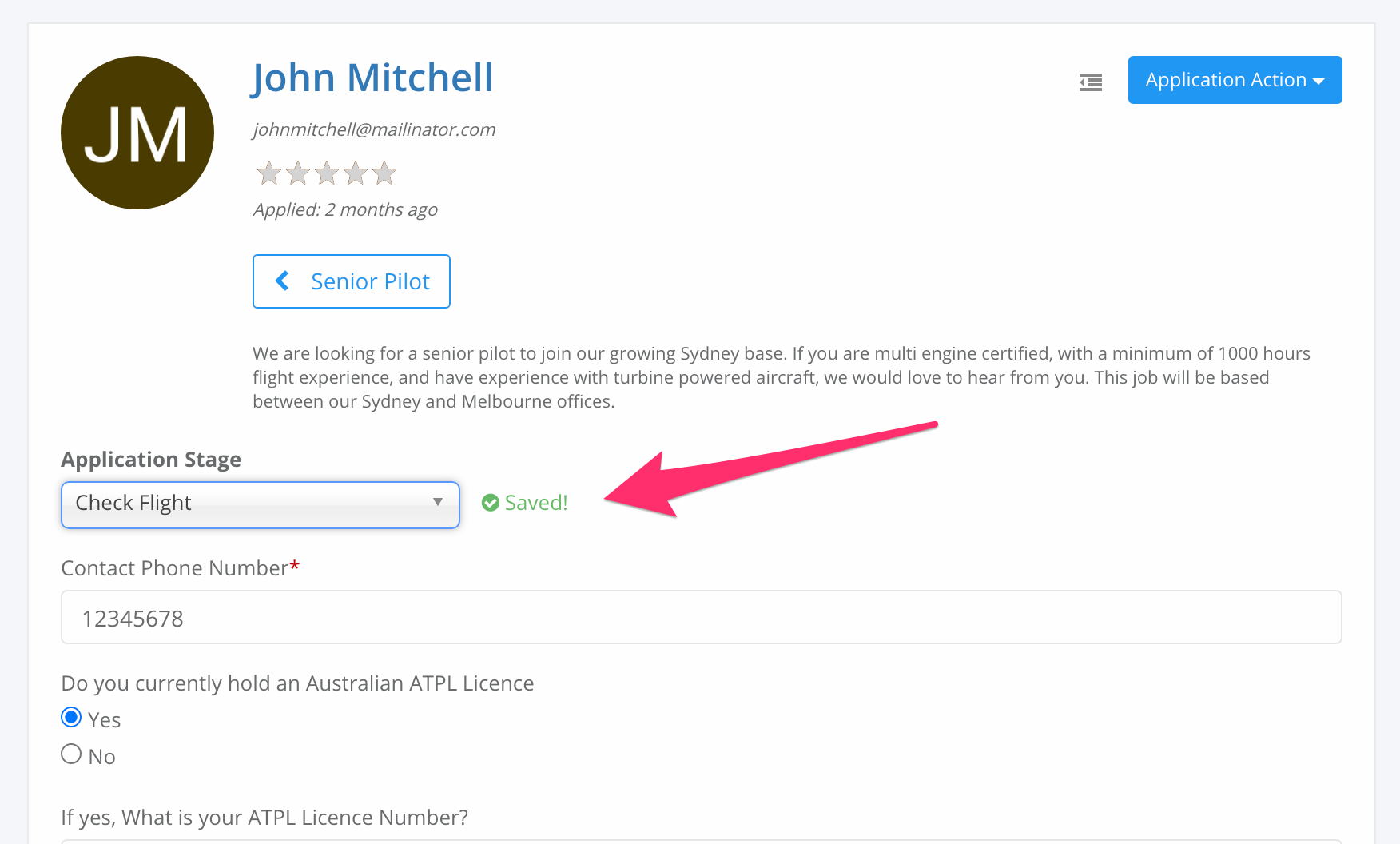
Well, we have introduced 'auto save' on this field now, so as soon as you change it, the new stage will be automatically saved against this application.

You will even see a little 'Saved!' notification pop up to let you know that the information has been permanently stored.
We hope these changes will improve your user experience around the Recruitment module. We have really listened to what our customers want, and our designers have worked hard to come up with a solution that helps rather than impedes your normal workflow.
Let us know what you think by clicking on the little chat icon on the lower right of HR Partner and shooting us a message!
