Changes to Employee View
We are rearranging some screens to try and make it neater and cleaner in terms of presenting important information and functionality to you.
We've just made some small, but important changes to the Employee View screen on the admin portal. Hopefully these new changes will help you to be more productive, but we understand that any layout change like this can be confusing at first.
Here is what the old Employee View screen used to look like:

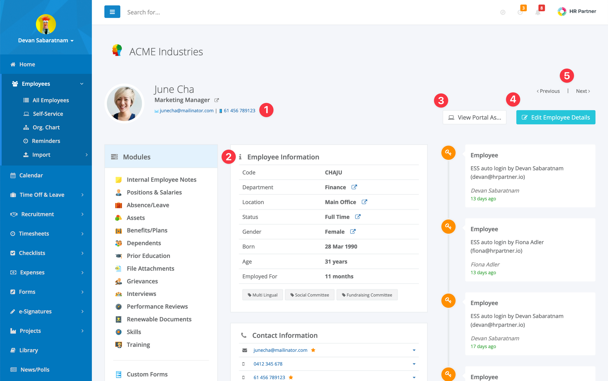
And here is what it looks like now:
These are the major changes:
- The employee's Primary email and mobile number are displayed under their name and position, and you can click on either to send them an email or SMS message no matter which submodule you may be looking at.
- The employee information that used to go across the top of the screen (i.e. Code, Department, Location etc.) is now displayed in the top middle column, along with any Tags the employee may have against them.
- The button to view the employee portal as them (available only to admins with the relevant permission to log in as an employee) is now show on the top part of the screen, and is available no matter which submodule you may be looking at.
- The button to Edit the employee information has been moved over to the far right hand side of the screen and is now Light Blue instead of Green.
- We've introduced Next and Previous buttons to enable you to jump quickly to adjacent employees without having to go back to the main employee list.
The biggest benefit is that common tasks like sending an email or text message, or logging on to the employee portal is now available to you no matter which part of the employee view screen you are on.
So, you can be checking Absence records, and if you have a query, you can simply click the employee's email under their name to send them an email with any queries.