A different way of looking at leave
For the past few months, our growing custom base have been suggesting that they would like to be able to see the leave calendar in a 'flat' format, similar to a Gantt chart display.
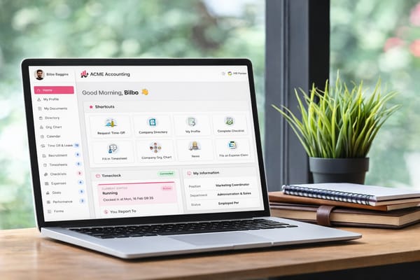
Well, today we are pleased to announce that we have added this new layout to our app. Not only that, you can now also get a larger display of the main leave calendar view too! (Yes, we agree that for companies with lots of employees, the small calendar on the dashboard was just too little!) :)
So now, under the 'Time Off/Leave' menu option on the left hand side, there is a new option for 'Calendar' which will show you the bigger leave calendar. And like the org chart, there is a toggle button on the top right which will switch you between the normal calendar view and the 'scheduler' view.
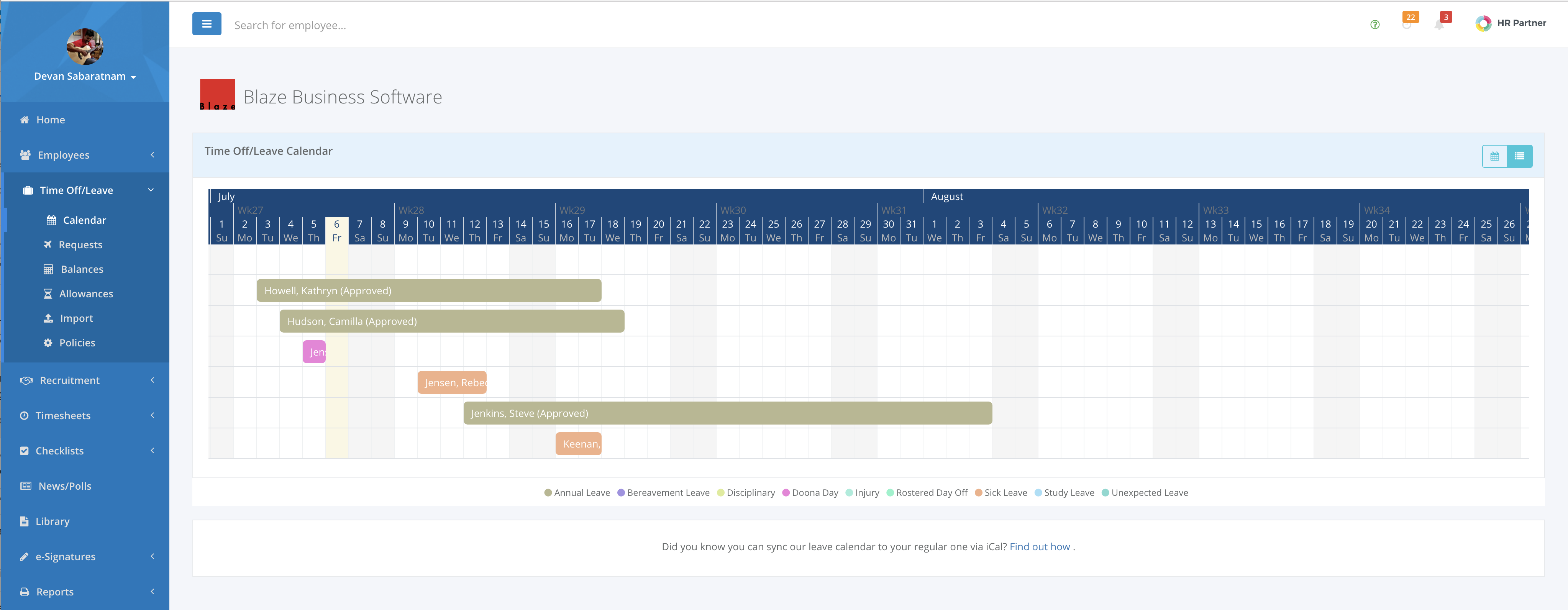
We hope this helps you all with better planning for your staff leave allocations.