Recruitment UX improvements
Announcing some more new UX improvements in our recruitment module to make your hiring life a little easier.
We can't believe how popular our recruitment module in HR Partner has become lately. Especially during these recent turbulent times, when hiring has become a huge challenge for lot of companies, given the large pool of applicants in the job market at the moment.
We have heard of customers getting hundreds, and sometimes thousands of applicants for their job listings, and while HR Partner could comfortably handle up to a couple of hundred applicants at a time, we found that with larger numbers, our user interface was starting to struggle a little bit.
We recently released a new sidebar widget for Recruitment, which helps to make it more efficient to navigate through your list of applicants, but we knew we could do more, so today we have released a new change that allows you to customize the job listing view screen a little better.
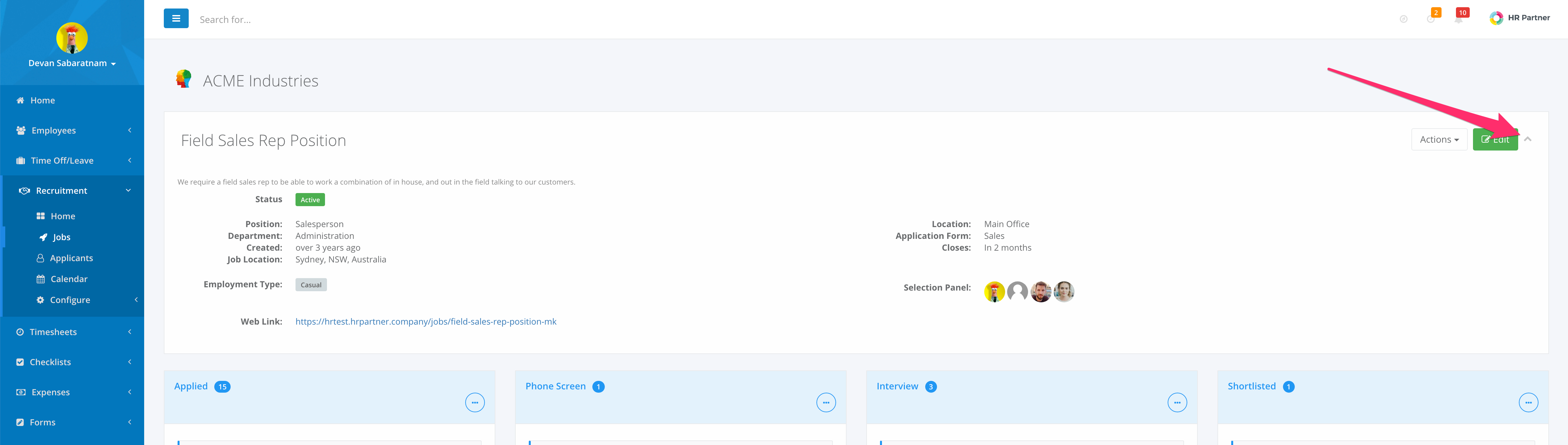
The first change we made was to allow you to collapse the details about the job listing at the top of the screen, to give you more screen real estate to look at your candidates:
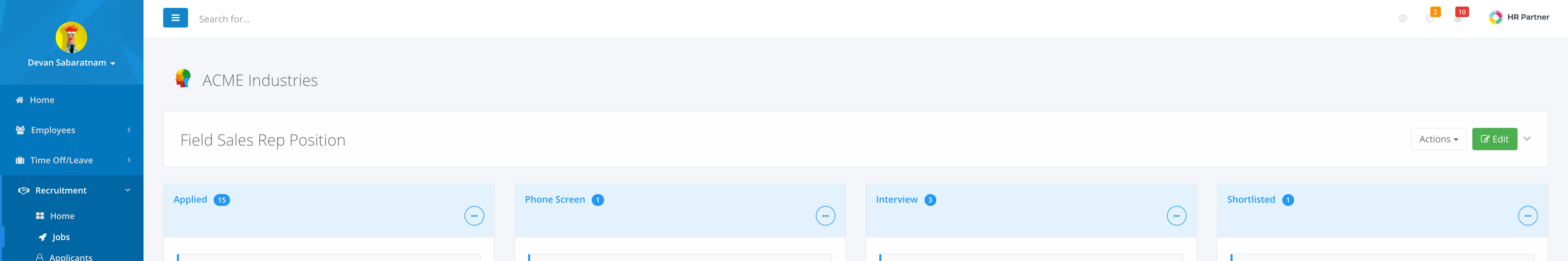
The second major change we did was to allow you to configure the height of the Stage 'boxes' on the screen to make it easier to navigate through your candidates side by side.
Previously, the stage boxes would expand dynamically to show you all the applicants in that particular stage. Fine if you only had about 20 or 30 applicants in each stage, but if you have 250+, then the stage box was super long and painful to scroll through in order to click and drag an applicant to another stage.
So what we allow you to do now is to set the height of the Stage box via the drop down menu on the top right of each box:
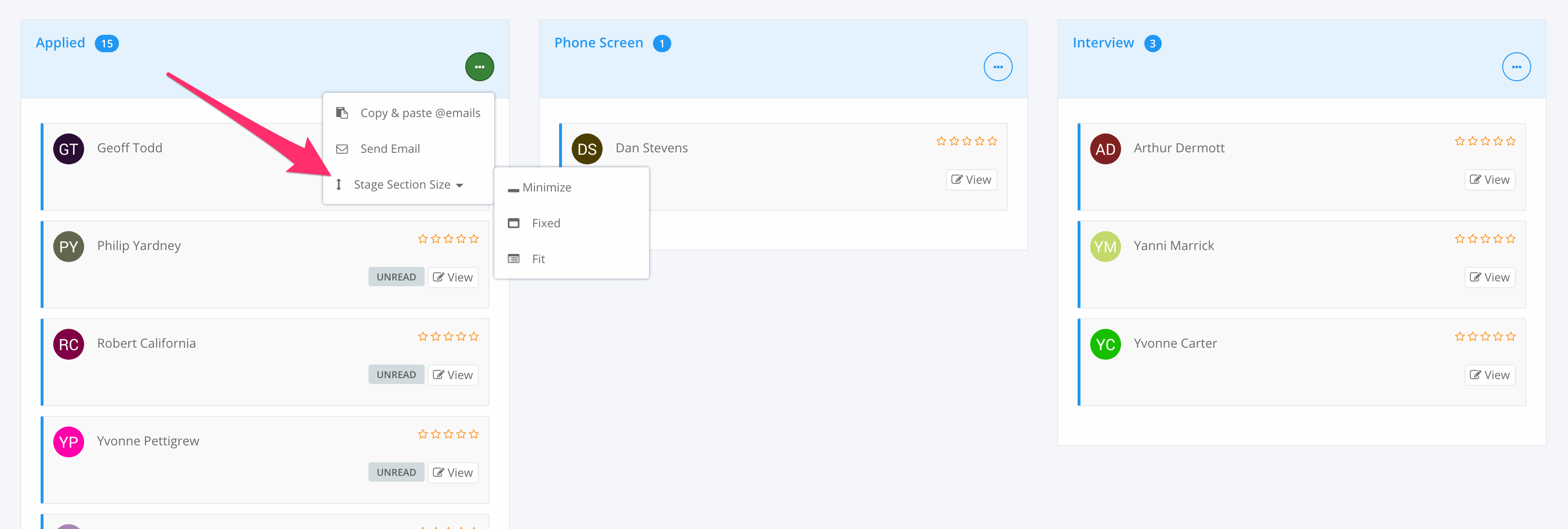
The options are as follows:
| Minimize | Collapses the box completely so you cannot see anyone in that Stage. Very useful for stages like 'Rejected' etc. where you don't wish to have their names cluttering up the screen any more. |
| Fixed | Sets the stage box to a fixed height (approx. 3/4 of the screen height) and adds a scrolling bar to the box so you can scroll within the box without losing sight of the rest of the page. |
| Fit | Same as what happens now - the box will simply expand to fit all candidates within it. |
(As an added bonus, we now also show you the number of applicants in each stage right next to the stage heading!)
The other good thing is that the system will 'remember' your box size settings in between sessions (the settings are stored on your local browser, so if you change browsers, you might need to reset it on the new one!).
Check this video for a quick demonstration of how these new features work:
We hope this makes your recruitment selection process much smoother and easier in HR Partner. Please let us know what you think at support@hrpartner.io