
New chart reports in HR Partner
This month, we have release a great new feature in HR Partner - graphical reports! A few users have been asking for a better layout for critical KPI reports that they can present to management, and we have listened and released our first couple or reports this month.
The Graphs
At time of this post going live, we have two reports available.
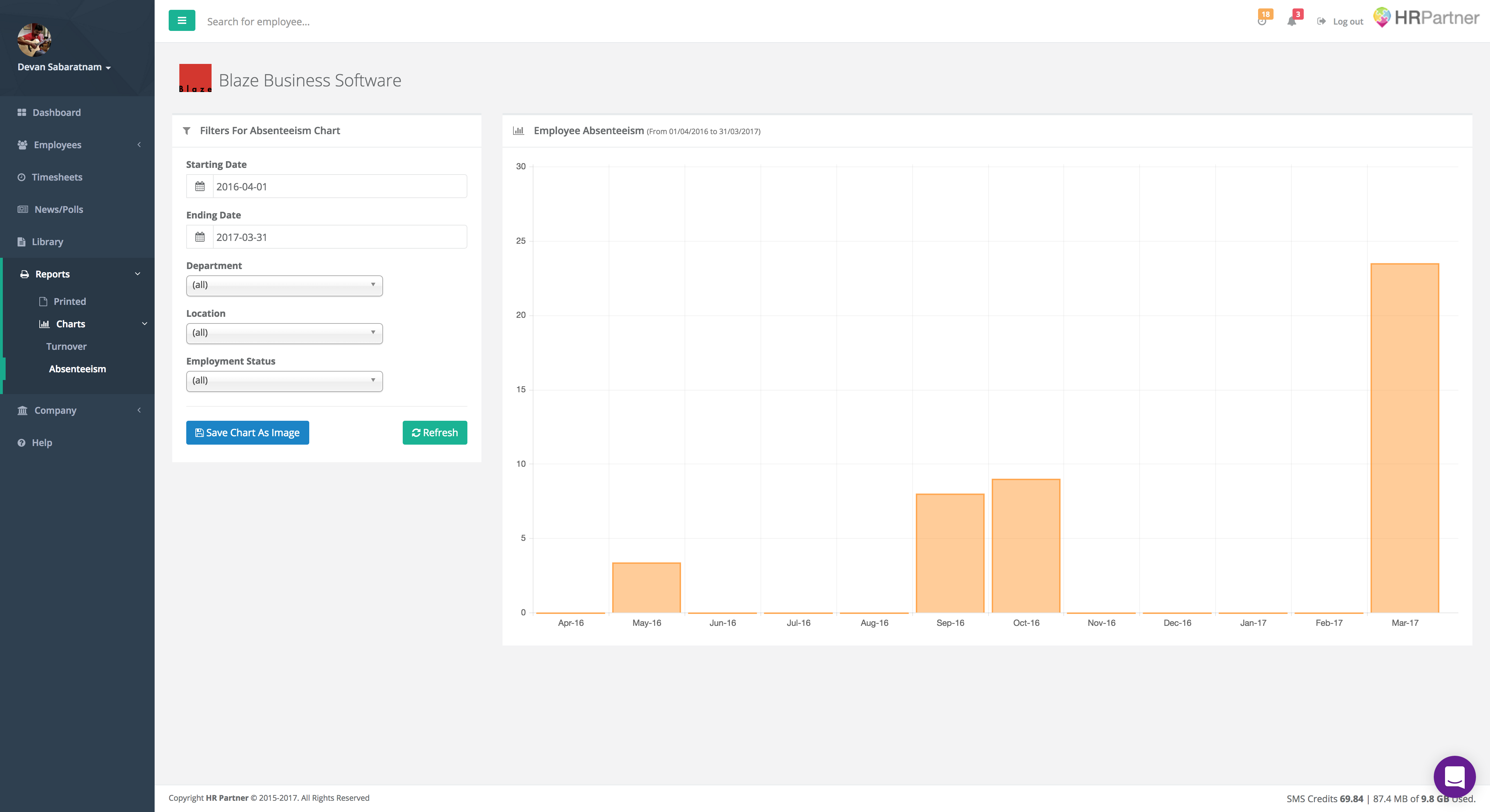
Absenteeism Report
This is a chart showing the number of days employees have been absent from the company, based on the entries in the Absences module. It is basically a mirror of the small graph on your dashboard, but the advantage here is that you can 'drill down' into the graph by choosing your own dates, and also reporting only for a certain department, location or employment type.
Turnover Report
This chart shows you the total number of staff hired and terminated over time, so you can get a quick visual of employment trends within your company. This report can also be filtered by date range, department, location and employment type for extra details.
Saving
One popular request that came along with these charts, was that users wanted to embed these graphs in their reports or emails to the management team, so with this (and all future) chart reports, we have included a button allowing you to save the chart as a PNG file which you can then embed or attach anywhere you like.
Future Direction
We plan to add a lot more graphs to this section over time, but we want to spend our development efforts on features that you will really need. Please feel free to send your suggestions directly to me at: devan@hrpartner.io