
Improved Org Charts
If you haven't noticed it yet in your HR Partner company account, we have recently completely refreshed the 'look and feel' of your company org. chart.
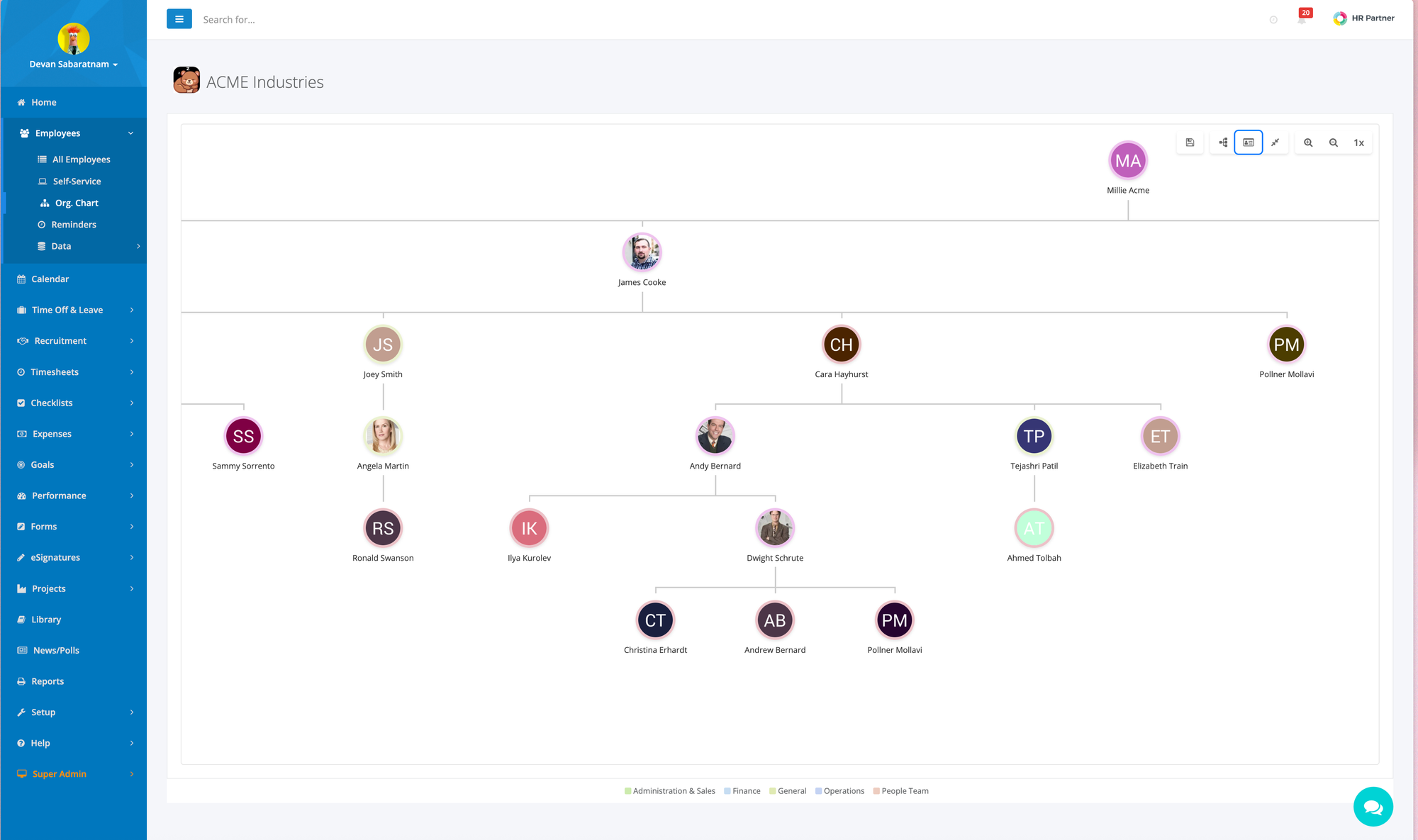
We went back to the drawing board to build a better way to show your team hierarchy, including some new display (and export) options.
If you haven't seen it, head over to Employees > Org Chart on your left hand menu in the admin portal (or click the Org Chart menu on the left of the ESS portal).
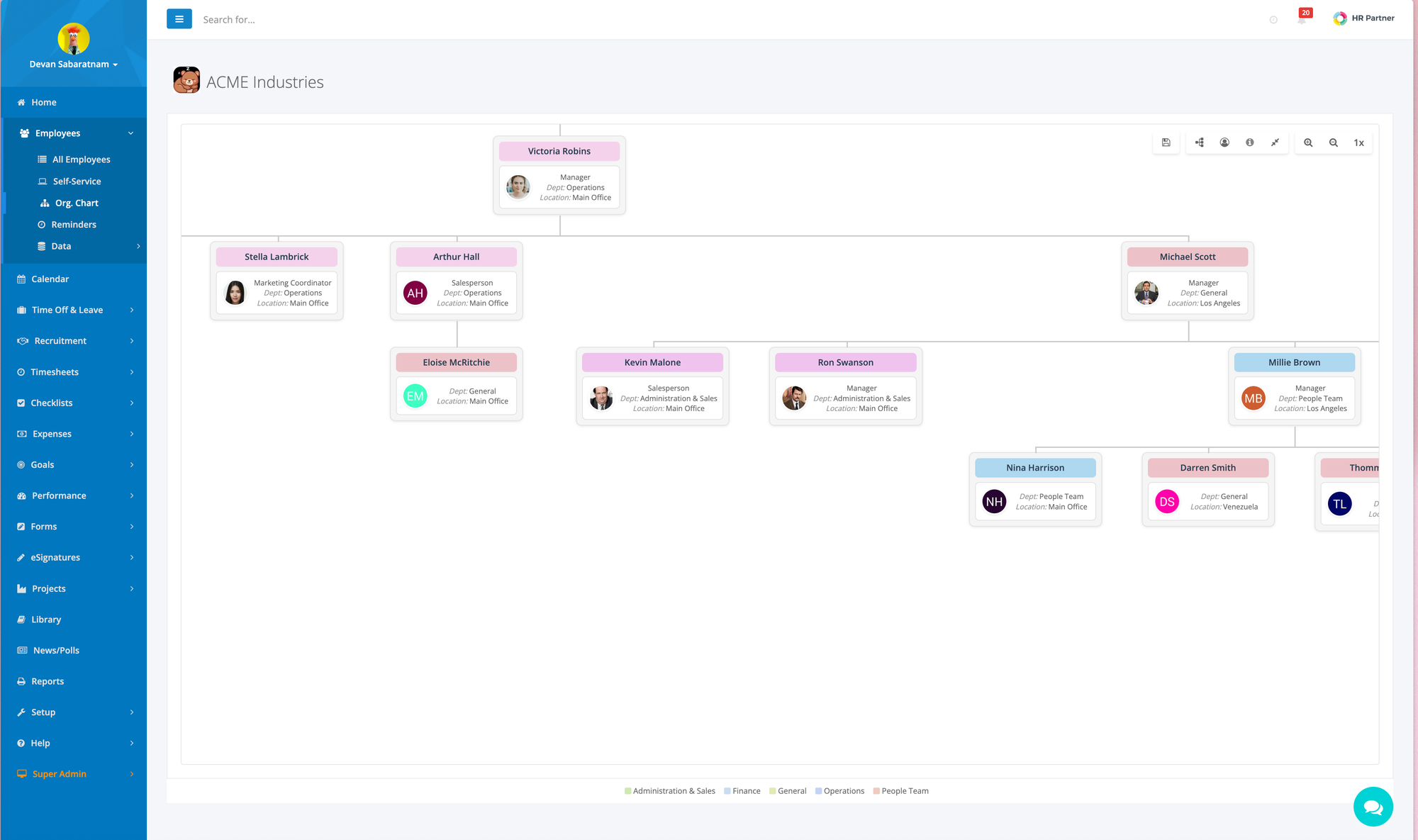
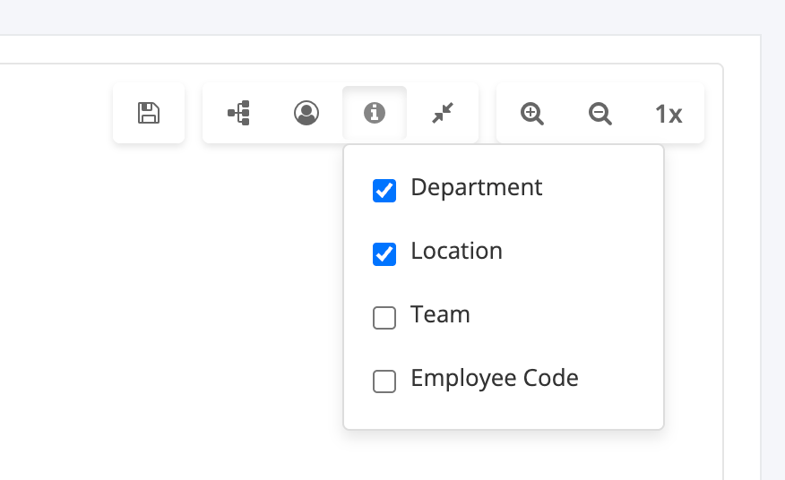
We have improved the presentation of the chart, and let you pick exactly how much information is included by using the toolbar at the top right.
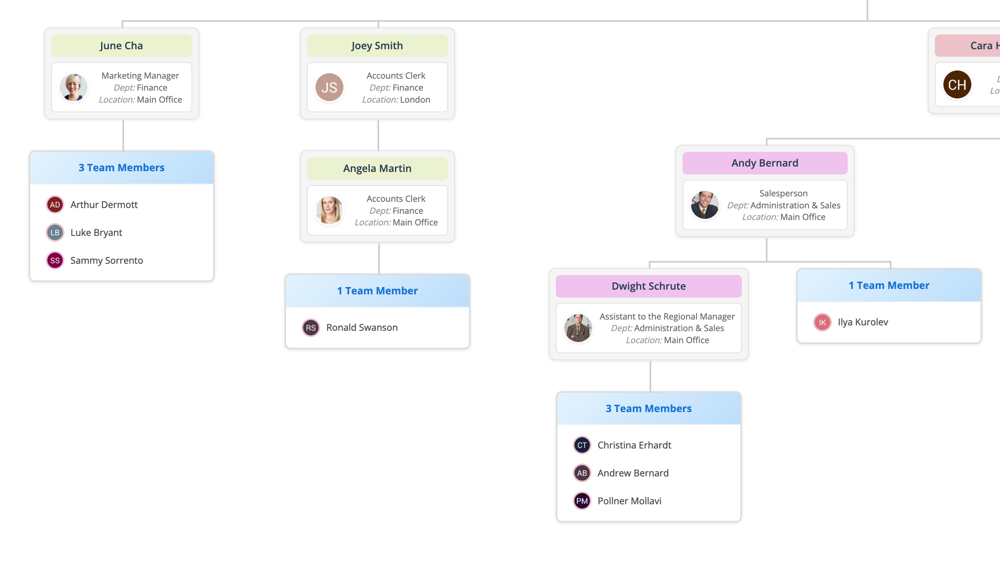
You can also make the chart less wide by consolidating all reports for a single manager in a list format, instead of spread out on another tree branch.
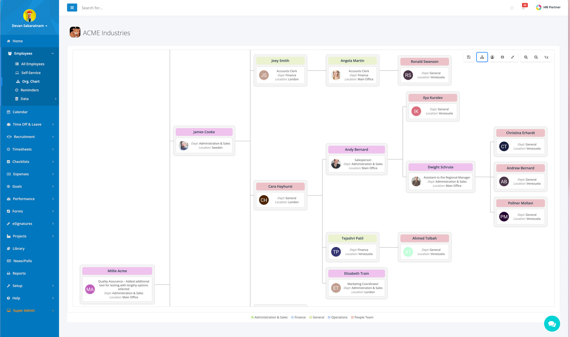
And you can also 'flip' the chart sideways to get a better view without scrolling left and right so much.
And if you find the 'card' format too much, you can also switch to the 'simplified' view showing just the avatars and position names, which takes up a lot less space.
Some other bonuses with the new charts are:
- You can now export the chart as a PNG file, or a SVG vector file (which is more scalable and editable without losing fine detail).
- You can now have more than one person at the very top of the chart structure, i.e. multiple CEOs at the top of the tree.
We look forward to your feedback and any suggestions for improvements that we can make to your team charts.